BR: Could you give us a brief bio of yourself?
GD: I’ve been designing film posters for over 15 years. Currently, I’m an Art Director at Empire Design in London.
BR: How did you get into poster design?
GD: As a kid, I loved the cinema, watching the films and looking at the cool posters and huge standees. I ended up studying a degree in Graphic Design and got more and more obsessed with film posters and knew that’s what I wanted to do. Even did my final Uni project on the Kill Bill campaign! Didn’t really think I would actually end up doing it for a living. It was the dream job! I sent my CV to a few London-based companies. Fortunately, Empire Design were looking for a new junior designer at the time, and I got invited in for a trial with a few other candidates. It was an amazing experience and I managed to get the job at the end of it. I felt incredibly lucky to be given the opportunity and I’ve never looked back.

BR: What’s your favourite film poster?
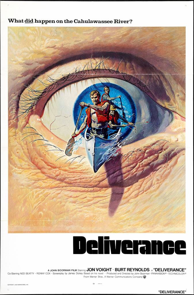
GD: That’s a tough question. There’s so many that I adore, but if I had to pick one i’d say the US one sheet for Fantastic Voyage. Love it! Simply beautiful. Keeping with the ‘eye’ theme though, I also love Bill Gold’s Deliverance poster. Gorgeous.
BR: What’s your favourite poster of your designs?
GD: I would have to say the UK Quad for Death Proof. I’ve always been a big Tarantino fan and his film posters have been so iconic over the years. I was so excited when Momentum Pictures asked Empire to look at the poster. Loved every minute working on the film and really pleased my design made it through.
BR: How did you get the offer designing the James Bond posters?
GD: Daniel Craig became the new 007 and Eon Productions were looking for a fresh look for the franchise. They came to Empire for our take on it and it’s been an incredibly unique experience ever since. Something, we’re very proud of at Empire.
BR: What’s your design process ?
GD: I’ll get a poster brief from the client, which I’ll read a few times to get a sense of what they want to achieve with the poster. Then, research, try and gather as much reference on the film as I can. Anything could spark an idea. When it comes to designing the poster, it depends on what stage the film is at in production, I’ll always try get a feel for the film through either reading a script, going through the unit photography or watching a rough cut of the film. Sketch ideas as I go and use those as a starting point to develop them into posters. I’ll put on a bit of Miles Davis and starting designing!
BR: How many people work in your team? Or do you prefer working alone?
GD: We have an incredible team in the studio at Empire. Each have their own styles and strengths and collectively we come up with great ideas to put to the clients. I’ll usually work on my own concepts but will often be a part of a team looking at particular campaign directions and bouncing ideas of each other. Or working with our illustrator on bringing concepts to life for photoshoot ideas.
BR: Have you got any interesting poster projects coming up?
GD: I would love to tell you what’s on the horizon but unfortunately I’m not allowed.
BR: Who are your design heroes?
GD: One name has always inspired me, the legendary Bill Gold. An incredible designer. His work was so simple and striking. He created some of the most iconic posters for the most iconic films. I could look at his work for hours. Simply beautiful.

BR: Can you show us any concept work, for your previous designs?
GD: Possum…….
Working with the talented Illustrator Joseph Avery (Joseph Avery.art), who also did the illustrations in the film. We had the idea of taking inspiration from an unnerving scene in the film, which has the creature slowly creeping out of the bag onto the bed. Joseph did a rough sketches of how we could show the concept. I then used the illustrations to do some options to give to the client, which including adding the long shadows, making the bed extra long etc. I also tried to reversing the shot and having the lead character at the other end of the bed. As well as a completely different angle which was inspired by one of Josephs other illustrations. In the end, it was agreed that the Possum is best when its at the top of the bed facing you. Joseph worked up the final illustration, which i then used to create the key art. Treatment in the final artwork is much heavier and the bed extra long to create an unnerving claustrophobic poster.
Knocking…..
Here are a couple of sketches that I did when coming up with some of the concepts. In the film, the lead character is constantly tormented by knocking and noises coming from the all around her in the apartment and nobody believes her. I wanted to portray the madness of her trying to escape her own mind in someway. One of the sketches is quite close to how the keyart turned out. When I originally used the window for the eye, I felt it didn’t quite have the impact as I was looking for, so i reverted back to the eye and pushed the highlights to represent the window. Really pleased with how it turned out.
BR: What is your earliest poster design ?
GD: UK quad for Goal: The Movie! The one where he’s standing alone on the beach arms stretched out looking hopeful. I’m sure you’ve seen it… Ha! For me, this was a very proud moment and something I’ll always remember. To get your first poster through the door and to see out in the world is a fantastic feeling. I get the same excitement today as I did then

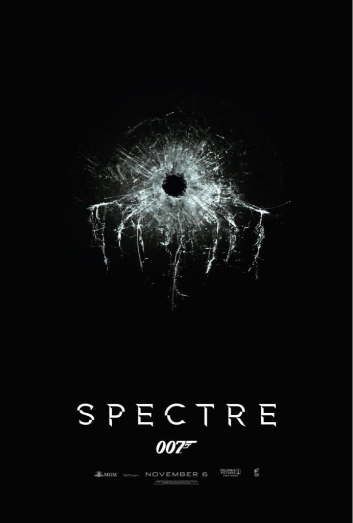
BR: How did you get the idea for the amazing Spectre broken glass poster?
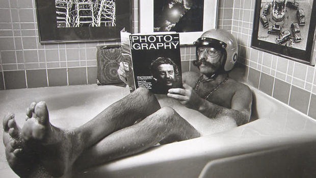
GD: For that particular poster, all we had was a name to go off. But the name, Spectre, has so much history within the franchise that I had a lot of reference to play off. For me it was important to create a striking image that drew the audience in but didn’t overshadow the great title they were announcing. I’ve always loved the BW Photo of Roger Moore behind the shattered glass and felt it would be a great way to tease the the iconic Spectre symbol and felt very much in the 007 world. Loved how it turned out. In the final film, there’s a scene towards the end which you actually see the Spectre shape extruding from a bullet hole in the glass… I love the idea of that being inspired by the poster I designed, but I very much doubt. Nice thought though.
You can see more of Daltons Work Under @garydalton_posters and @empiredesign


0 Comments for “Gary Dalton Poster Designer, Interview Feb 2021”